The situation
Users were arriving.
Then quietly leaving.
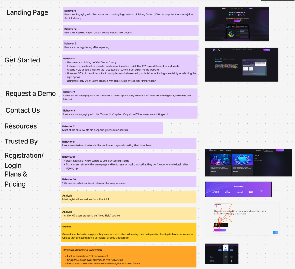
Asuretify is an insurance compliance platform. The traffic numbers were healthy. Users were finding the product, exploring it, spending time with it. And then they were leaving without registering.
No error messages. No rage clicks. No obvious friction. Just a pattern of quiet exits from a product people seemed genuinely interested in.
The first instinct was to assume the value proposition wasn't landing, maybe better copy, a stronger hero, a cleaner visual. But the data suggested something more specific was happening.
Root Cause
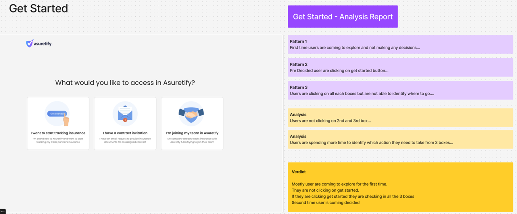
Users couldn't answer one question:
What happens next?
The issue wasn't trust, pricing, or usability.
Users were evaluating risk.
Before registering, they wanted to understand who the platform was for and what would happen after signup.
Design goals
Turning research into
strategy.
Once the root cause became clear, the redesign was no longer about visual improvements.
It was about reducing uncertainty, clarifying audience fit, and helping users understand
what happens after they engage with the platform.
The redesign focused on three outcomes: helping users identify whether the platform was relevant to them, reducing uncertainty around onboarding, and making the next step feel predictable before asking for commitment.
The design direction
Clarity before
commitment.
The existing page was organized around what Asuretify could do. But users were asking a different question, not "what does this platform offer?" but "what happens to me specifically, right after I click register?"
That question was never answered. The site moved from features to pricing to CTA without ever describing the onboarding experience. Every returning visit to the pricing page was a user trying to find that answer and not finding it.
The ask came before the answer. Move the answer first.
Information Architecture Redesign
Restructuring the decision-making journey.
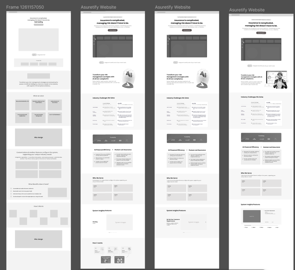
Before
· Hero with features list
· Register CTA (too early)
· Dense feature breakdown
· Pricing (feature-focused)
· Registration form
After
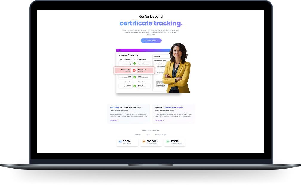
→ Hero with outcome statement
→ How it works (process-first)
→ What happens when you register
→ Pricing (outcome-focused)
→ Register CTA (contextual, low-risk)
Final solution
Reducing uncertainty through
clarity.
Every major design decision was connected directly to a research finding.
Design decision 01
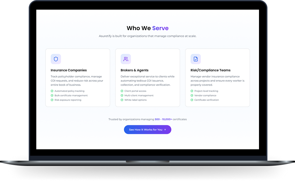
Clarifying who the platform serves.
Research showed users struggled to understand whether the platform was relevant to them.
Dedicated audience segmentation helped users immediately identify their role.
Design decision 02
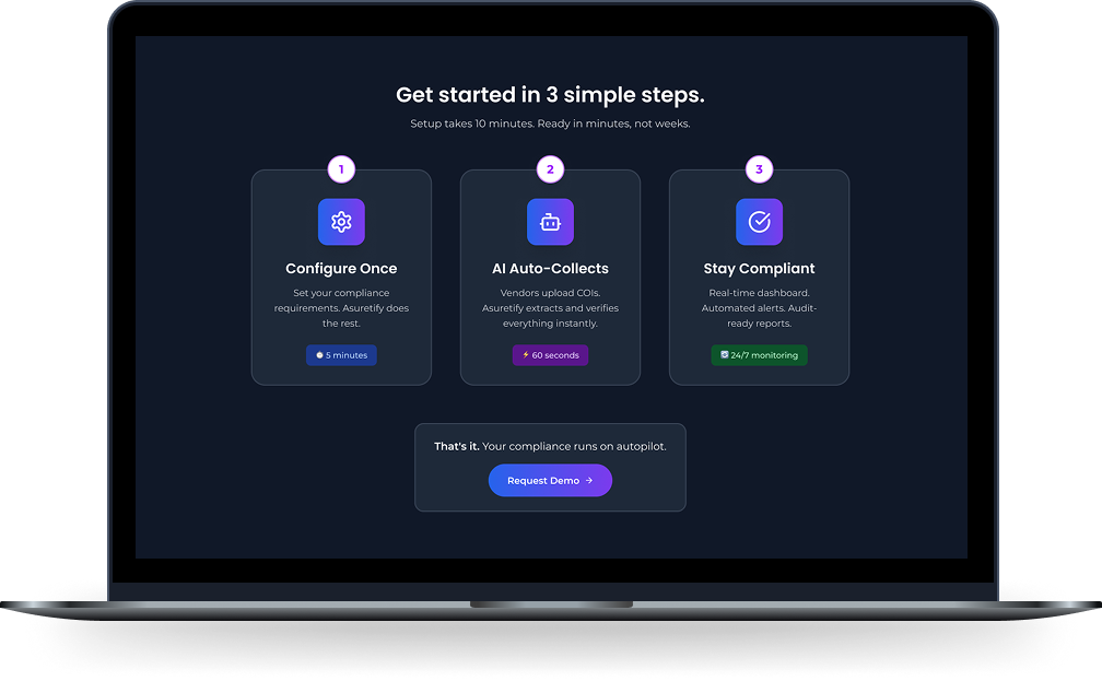
Showing what happens after signup.
Instead of asking users to commit immediately, the redesigned website explains the onboarding process before asking for action.
Design decision 03
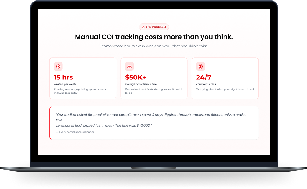
Leading with the problem.
The redesign reframed the conversation around business pain points before introducing platform capabilities.
Design decision 04
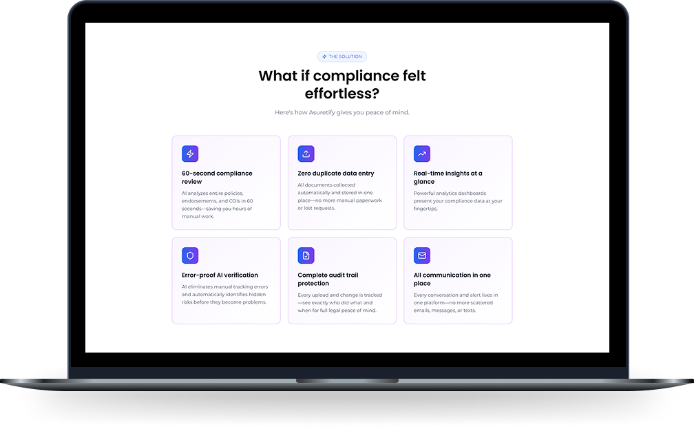
Turning features into outcomes.
Rather than listing capabilities, the redesign focused on outcomes users care about: speed, visibility, compliance, and confidence.
Reflections
Designing for decision-making.
- 01Behavioral data without hypothesis-first observation is richer. I found the real problem by watching without an agenda, not by testing assumptions.
- 02When users leave without rage clicks, they're not confused, they're deciding. That is a different problem than usability friction, and it needs a different solution.
- 03Information architecture changes can have more impact than visual redesigns. The biggest improvement came from changing the order of information, not the appearance of the interface.
- 04The question users are silently asking is almost never the one the product is trying to answer. Find the silent question first.